
The Ultimate Guide to Building a High-Converting E-commerce Website: Turn Clicks into Customers
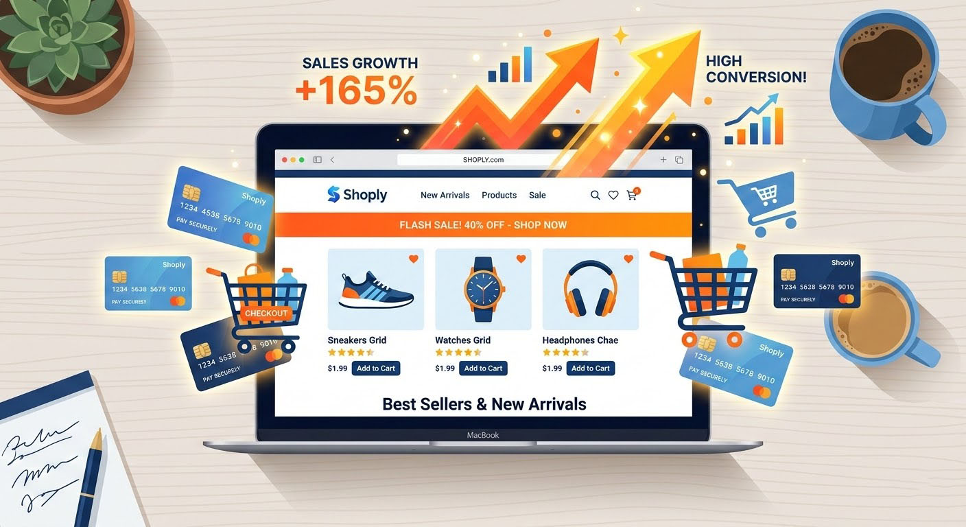
Driving thousands of visitors to your online store is an impressive feat, but it is ultimately meaningless if those visitors leave without making a purchase. In the hyper-competitive world of online retail, traffic is just the beginning. The true metric of success—the one that directly impacts your bottom line—is your Conversion Rate.
If you are pouring budget into SEO, Google Ads, and social media marketing but seeing a dismal return on investment (ROI), the problem likely isn’t your product. The problem is your website.
Over the past 7+ years of architecting and developing premium digital experiences, I have analyzed countless user journeys, audited underperforming stores, and built custom e-commerce solutions from the ground up. Whether utilizing the robust ecosystems of WordPress and Shopify, crafting visually stunning layouts with Elementor and Divi, or engineering lightning-fast headless applications with Next.js and React.js, the core principles of conversion remain the same.
A high-converting website is not a happy accident. It is a meticulously crafted machine built on the pillars of speed, user psychology, frictionless design, and unshakeable trust. In this comprehensive masterclass, we will dive deep into the exact strategies, technical implementations, and design philosophies required to build an e-commerce website that consistently turns clicks into loyal customers.
Chapter 1: The Foundation of Speed—Why Milliseconds Matter
Before a user can appreciate your product imagery or read your persuasive copy, your website has to actually load. In the modern digital landscape, speed is not just a technical metric; it is the first impression of your brand.
The Brutal Reality of Page Load Times
Amazon famously calculated that a page load slowdown of just one second could cost them $1.6 billion in sales each year. While your store might not be moving Amazon-level volume, the psychological principle applies universally: modern shoppers have zero tolerance for latency.
1-3 Seconds: The optimal load time. Bounce rates remain low.
3-5 Seconds: The danger zone. Bounce rates increase dramatically, often by over 30%.
5+ Seconds: You have effectively closed your digital storefront doors. The majority of users will abandon the site and likely purchase from a competitor.
Technical Strategies for Blazing Fast Performance
To achieve top-tier performance, you must optimize both the frontend delivery and the backend architecture.
1. The Headless Commerce Revolution (Next.js & React.js)
For brands that are scaling rapidly and need absolute peak performance, traditional monolithic CMS architectures can sometimes become bottlenecks. This is where “Headless Commerce” comes in. By decoupling the frontend user interface from the backend e-commerce engine (like Shopify Plus or WooCommerce), you unlock unprecedented speed.
Using a React framework like Next.js, developers can utilize Server-Side Rendering (SSR) and Static Site Generation (SSG). This means the web pages are pre-built and served almost instantly via a Content Delivery Network (CDN). The result? Perfect Core Web Vitals scores, instant page transitions, and an app-like experience that keeps users deeply engaged without the frustration of loading spinners.
2. Optimizing the WordPress & Shopify Ecosystems
If a headless approach isn’t feasible for your current business model, you can still achieve blazing speeds on traditional platforms:
Asset Minification: Shrink HTML, CSS, and JavaScript files. Remove unused CSS that bloats the page.
Advanced Caching: Implement object caching (like Redis or Memcached) and page caching. On WordPress, premium caching mechanisms are non-negotiable.
Image Optimization & Next-Gen Formats: E-commerce sites are incredibly image-heavy. Serving unoptimized JPEGs or PNGs is a fatal error. All media must be compressed and served in WebP or AVIF formats. Implement “Lazy Loading” so images only load when they enter the user’s viewport.
Clean Code and Lean Themes: Avoid bloated, multipurpose themes. If you are using page builders like Elementor or Divi, ensure they are configured optimally, disabling unused widgets and utilizing their performance-enhancing features (like DOM optimization and inline CSS).
Chapter 2: Mobile-First Design—Capturing the Modern Shopper
We no longer live in a desktop-first world. Over 60% of all global e-commerce traffic, and a rapidly growing percentage of actual transactions, occur on mobile devices.
Many businesses make the critical mistake of designing a beautiful desktop website and simply allowing it to “collapse” into a responsive mobile view. This is backward. To maximize conversions, you must design for the smallest screen first.
The Anatomy of a High-Converting Mobile Store
1. The “Thumb Zone” Navigation
Hold your smartphone with one hand and trace the area your thumb can comfortably reach without stretching. This is the “Thumb Zone.” Your most critical conversion elements—specifically the “Add to Cart” and “Checkout” buttons—must live permanently within this zone.
Implement sticky “Add to Cart” bars that remain visible at the bottom of the screen as the user scrolls through a long product description.
Ensure navigation menus (hamburger menus) are easily accessible, but don’t hide search bars behind clicks. A visible search bar on mobile drastically increases conversion rates.
2. Fluid Micro-Interactions
A premium mobile experience feels tactile. When a user taps a button, there should be immediate visual feedback. Utilizing modern animation libraries like Framer Motion allows developers to create smooth, physics-based micro-interactions. Whether it’s a subtle hover effect, a sleek drawer menu sliding in, or a satisfying animation when an item drops into the cart, these details elevate the perceived value of your brand.
3. Eradicating “Fat-Finger” Errors
Mobile screens are small, and human fingers are imprecise.
Ensure all clickable elements (buttons, links, form fields) have a minimum touch target size of 48×48 pixels.
Provide ample whitespace around interactive elements to prevent accidental clicks, which cause immense user frustration.
Chapter 3: Visual Storytelling and Persuasive Copywriting
Because e-commerce customers cannot physically hold your product, feel its texture, or see its true scale in person, your digital presentation must compensate for this lack of sensory input.
Masterful Visual Merchandising
Your product pages are your digital salespeople. They need to be impeccable.
High-Resolution, Multi-Angle Imagery: Provide highly detailed images showing the product from every conceivable angle. Include macro shots highlighting texture and build quality.
Contextual Lifestyle Photos: Don’t just show the product on a sterile white background. Show it being used in real life. If you sell luxury hand care products, show the cream being applied in a premium, spa-like setting. This helps the user visualize the product in their own life.
Integrated Product Video: Video is a massive conversion driver. A short, 15-second clip demonstrating the product in action can increase purchase intent by over 80%.
3D Models and Augmented Reality (AR): For furniture, fashion, or complex items, allowing users to spin a 3D model or view it in their room via AR is becoming the new gold standard for premium brands.
Copywriting That Converts
Vague, generic product descriptions kill sales. Your copy must bridge the gap between features and benefits.
Focus on the Transformation: A feature is what the product is (e.g., “10,000 mAh battery”). A benefit is what the product does for the user (e.g., “Charge your phone fully up to 3 times without needing a wall outlet”). Sell the benefit. Sell the transformation.
Scannability: Users rarely read online; they skim. Break up long blocks of text with bold headings, bulleted lists, and short paragraphs.
Urgency and Scarcity: When used ethically, indicating low stock (“Only 2 left in stock!”) or time-sensitive offers (“Order within 2 hours for next-day delivery”) can push an undecided shopper to make a purchase.
Chapter 4: The Psychology of a Frictionless Checkout
You have done the hard work. The user found your site, loved the fast performance, engaged with your beautiful mobile UI, and clicked “Add to Cart.” Now comes the most critical phase: Checkout.
The average cart abandonment rate across all industries is a staggering 70%. This means 7 out of 10 people who intend to buy end up leaving. Optimizing this funnel is the fastest way to increase revenue.
Eliminating Checkout Roadblocks
1. The Cardinal Rule: Never Force Account Creation
Forcing a user to create an account before they can hand you their money is the single biggest conversion killer in e-commerce. Always, without exception, offer a highly visible Guest Checkout option. You can always ask them to save their details after the purchase is complete.
2. The Single-Page vs. Multi-Step Checkout Debate
Whether you use a single-page checkout or a multi-step accordion (a feature I frequently custom-code for specialized workflows), the goal is psychological momentum.
Keep form fields to the absolute bare minimum. Do you really need their company name or a secondary phone number? If not, delete the field.
Use auto-complete functionality for addresses via the Google Maps API to save the user keystrokes.
3. Omnichannel Payment Gateways
If a user reaches the final step and doesn’t see their preferred payment method, they will leave. You must accommodate the modern digital wallet. Alongside standard credit card processing (Stripe, Authorize.net), you must integrate express checkout options like:
Apple Pay
Google Pay
PayPal
Buy Now, Pay Later (BNPL) options like Klarna or Afterpay (which have been shown to increase average order values by 40%).
4. Absolute Transparency with Costs
Unexpected costs at checkout (shipping fees, taxes, handling fees) are responsible for nearly 50% of abandoned carts. Be brutally transparent about shipping costs on the product page, or better yet, build the cost into the product price and offer “Free Shipping.”
Chapter 5: Building Unshakeable Trust and Social Proof
In the era of dropshipping scams and data breaches, consumer skepticism is at an all-time high. Trust is the currency of e-commerce. If a visitor doesn’t trust your site, no amount of brilliant design or fast loading speeds will convince them to input their credit card number.
Strategies for Institutional Trust
1. Prominent and Authentic Social Proof
Reviews are non-negotiable. Over 90% of consumers read online reviews before making a purchase.
Display star ratings immediately below the product title.
Encourage User-Generated Content (UGC). Allow customers to upload photos of themselves using the product alongside their reviews. A raw, unedited customer photo builds far more trust than a polished studio shot.
Do not delete negative reviews. A perfect 5.0 star rating looks fake and suspicious. A 4.7 average with a few reasonable critiques actually increases trust.
2. Visual Trust Signals
SSL Certificates: Ensure your site is strictly served over HTTPS with a valid SSL certificate.
Trust Badges: Display recognized security badges (McAfee Secure, Norton) and payment gateway logos near the “Add to Cart” and checkout buttons.
Professional Branding: A cohesive color palette, consistent typography, and a pixel-perfect layout subconsciously communicate that you are a legitimate, well-funded business, not a fly-by-night operation. This is where expert implementation utilizing tools like Tailwind CSS ensures a rigid, professional design system across the entire site.
3. Ironclad Policies
Your Return Policy, Shipping Policy, and Privacy Policy should not be hidden in microscopic text in the footer. Make them accessible. A generous, “No-Questions-Asked 30-Day Return Policy” completely removes the financial risk for the buyer, drastically increasing their willingness to convert.
